Turn off any tone layers you may have put in by setting them to "invisible." They will get in the way of "magic wanding" areas for filling with grey or color.
NOTE ON LAYERS
Lastly, make sure that any new layers you set up for filling colors or grey shades are set to "multiply" mode. "Multiply" layers will blend into each other, and allow black lines (like your original artwork) to show through no matter what.
"Normal" layers place one thing opaquely on top of another, covering everything that is below. If you color even a little bit outside the lines, some of your lineart will be lost underneath.
|
|
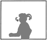
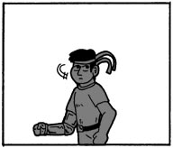
| A normal layer covers up all the line art, making it necessary to work with painstaking detail. | A multiply layer allows for quick filling with solid colors or gradients because black lines show through. |
SHADOWS AND LIGHT
While it takes a bit more time, sometimes it pays to do detail work with greys. It helps to better define a person or object in three dimensions by showing the interplay of shadow and light across the figure's surface.
FLAT COLOR
This is similar to cell animation or sunday comic strips. Flat, unshaded color that fills in the areas between the lines. This is another perfectly valid stylistic choice and could well be useful if you want to color, but are pressed for time.
ADVANCED COLOR
Now highly visible in comics these days (in particular, Udon's "Street Fighter" comics and now-defunct Dreamwave's "Transformers" comics), it combines layers of color with layers of greyscale shading.
You can add depth by pushing the farthest plane back by coloring it the darkest shade of grey. Closer planes of the background can be a lighter shade of grey, as can the foreground plane. The midground, speifically your primary subject, should be white.
If you want to make your subject more three dimensional, you can use the light and shadow techniques described later (see "charioscuro" below). But, it is best to shade lightly, as great shading contrast will take away from the emphais that was placed on your subject by the contrast of dark background with a light figure in the positive space.
BASIC FLAT COLOR
The principle here is a simple one: Color inside the lines. You can fill areas with whatever color you choose. Alternatively, you can fill with gradients or patterns if your graphics software allows you to do so.
After filling solid colors, you can also use additional colors to add a touch light and shade.
HOW TO MAKE IT HAPPEN
Step-by-step:
 |
 |
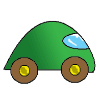 |
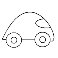
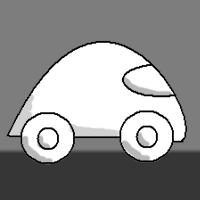
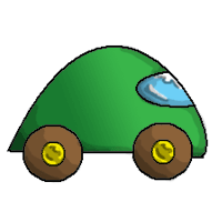
| This stylized automobile is our prototype image for these coloring demonstrations. | Greyscale Contrast See the gradient used in the background to show an artificial horizon. The paintbrush tool was used for light shading of the car. |
Flat Color Basic color fills were used for the tires, and there's a gradient on the body. Detail work was done with the paintbrush to highlight the hubcaps ad windshield. |
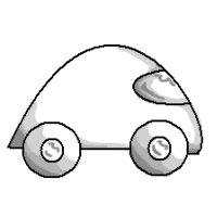 |
| Charioscuro The basic process is the same as a greyscale contrast, just executed differently. |
SOMETHING TO KEEP IN MIND
As you flesh out your three-dimensional figure with shadows, be sure that your shadows are consistent. First and foremost, they should look as though they can atually be produced by by the light source you have set up. Secondly, they all have to be consistent with each other.
 |
 |
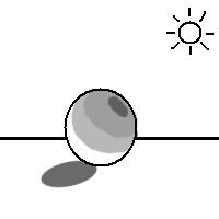 |
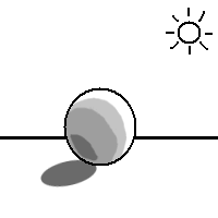
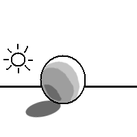
| Notice that the light source is behind the object in the upper right portion of the background. The ball is given a 3-D shape and feel because the shadow it casts and the shadows on its surface are consistent with this. | Here, the light source is in a completely different location. The shadows are unchanged. This doesn't look very realistic. After all, shadows are not cast behind an object when the light is also behind it. | Here, everything is all topsy-turvy. The shadow cast on the ball goes in one direction and the shadows on the ball's surface go in another. They are inconsistent with each other and just look wrong. |
 |
| The layer used in the charioscuro image and the layer used in the flat color image have been combined in this picture. |
WHAT TO DO
Step one: Make sure you convert your scanned and sized image into the 32-bit "millions of colors" setting.
Step one: Set up a blank multiply layer over your base background image. This layer will be filled in the same way that a charioscuro layer would be filled. Don't be afraid of heavy shading if it is necessary.
Step two: Turn the charioscuro layer "off" by making it "invisible." Over this layer, set up another blank multiply layer.
Step three: Use this second layer as a flat color layer. Color the image as you see fit.
Step four: Make all layers visible and save your file.
TO KEEP IN MIND:
Do not use a contrast-based greyscale layer in place of a charioscuro layer. The reason for this is that the layer of shadow is supposed to add to the subject's shape, while the layer of color is only supposed to add color. Color and shadows blend well, but the layer of contrast will interfere and create something that lacks depth, though you may end up liking it.
|
Alright!
First we drew it, then we scanned it, we toned it, and now we've shaded it! Surely it must be done now, right? Only if it's a comic about Marcel Marceau! What are they saying? Aren't there any sound effects? Learn how to put those together in the next tutorial! |
Next, on to Adding Word Bubbles!
|
|
"Active Stupor Heroes" is hosted by
Comic Genesis, a free webhosting and automation service for webcomics.
All material on this site is copyright 2002-2006 by me: Jason Tucker.
|
|


