-->advertisement***

How to Build A Better Comic

Screentones - Patterns at Work for You


What You Need

SOFTWARE YOU NEED
You need a graphics program that can handle layers. No layers, no tones. Don't even try this in MS Paint. While, in theory, it is possible to use tones with Paint, it is damn diffucult. You need Paint Shop Pro, PhotoShop, Gimp, or something else.

Also, you will need digital screentones. These can include patterns, textures, tones, and speedlines. The same techniques can also be used to import photographs as backgrounds.

HOW TO GET TONES AND SPEEDLINES

  • Antarctic Press sells CD packages of speedlines and screentones.
  • Comic Genesis artist Mandichan has some free tones.
  • Xopher has tones, speedlines, word bubbles, and more for free download.
  • Ashura Manga hosts the Screentone Depot

  • Art Concept - Positive Vs. Negative Space.

    POSITIVE SPACE
    Positive space is the area of the area of a composition (or the panel of a comic strip) that is occupied by the subject and any props they may be directly interacting with.

    NEGATIVE SPACE
    Negative space is "empty" space. It is the area of your composition that is not occupied by the subject and associated objects that they are interacting directly with. This includes background items, unimportant background people, scenery, and things of that nature.

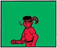
    The area that is indicated by the green is the negative space. It's pretty empty right now.
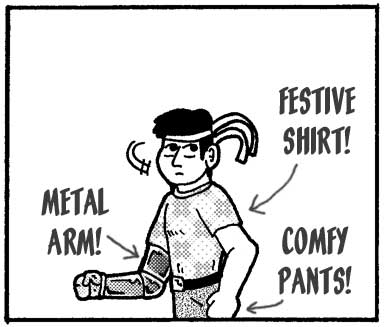
    The space occupied by the red color is the positive space. It is occupied by CyberJoe.
    WHY THIS IS IMPORTANT
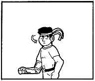
    If you put tones in your positive space, then this means that you are using the tones to add texture or shading to your figure. Choose tones that enhance the shape, lighting, or state of being of the figure.

    If you are putting tones into the negative space, then you are altering the atmosphere of the panel. The screentone you use should add to the setting, contribute to the mood, or place emphasis on something important in the positive space.

    Negative Space - Tones as Backgrounds

    WHY USE BACKGROUND TONES?
    Well, for starters, it's quick and easy. In addition to that, you can use it to achieve a wide variety of effects. Depending on the background you choose, you can convey emotion, provide the illusion of movement, or even artificially whip up a setting.

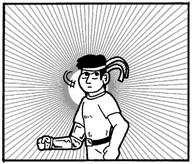
    This is the original image. The question mark background helps to establish an air of confusion in the midst of something appearing out of nowhere. This burst pattern could convey surprise, but often is better used to place emphsis on an important item or a godlike figure.
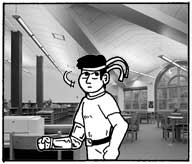
    Here's a good, all-purpose gradient. Works well to fill in negative space. Could also hint that something important is behind Joe. Stole a photograph from the web to make this background. It's cheating, yes, but you don't have to do it if you find the practice objectionable.

    "SPEEDLINES"
    It's an old manga (Japanese comics) trick that found its way to animation, and then into American comics and cartoons. If you have a bunch of lines that convey movement, you can enhance the feel of a figure in motion in a panel of your comic. They can radiate out from the center to indicate movement out of the page or can be parallel to indicate movement across the page.
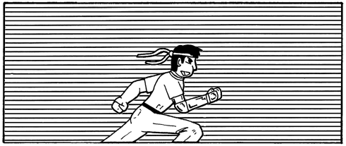
    HOW TO DO IT
    Here is the step-by-step on how to get what you need:

    1. First, find a digital screentone image that is appropriate for your needs for each particular panel.
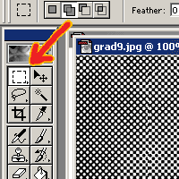
    2. Select the entire image ([Ctrl]+A in Windows) or use the rectangular selection tool to select a portion of the screentone image.
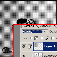
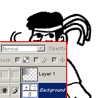
    3. Copy ([Ctrl]+C in Windows) or cut ([Ctrl]+X in Windows) your selection, then paste it ([Ctrl]+V in Windows) in a layer above your main image. Make sure that the layer is set to "Multiply" mode.
    4. Make the new, pasted layer "invisible" and work with the bottom layer.
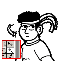
    5. Use the "magic wand" tool to select the background of your panel. If necessary, select multiple negative-space areas around your central positive-space figure.
    6. Make the upper layer visible again and then select that layer to work with.
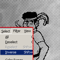
    7. Invert the selection you made. (Instead of selecting the background, you now have selected everything else.)
    8. Delete the new selection.
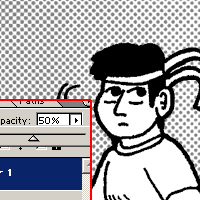
    9. Adjust the remaining portion of the layer as needed - brightness, opacity, color, et cetera.
    10. Using the paintbrush tool on the screentone layer, use pure white to clean up any areas you do not want the screentone to occupy.
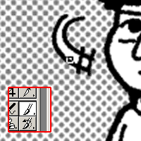
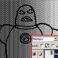
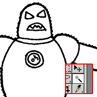
    Step 2:Selecting an appropriatly sized area of the digital screentone file. Step 3:Pasting the selection to a new "multiply" layer. Step 4:Choosing the picture layer. Step 5:Selecting the area of the background you want to fill.
    Step 7:Selecting the inverse. In PhotoShop, you can hit [Ctrl]+[Shft]+I. Step 9:Adjusting opacity. Step 10:Cleanup and detail work.

    Positive Space - Tones for Texture

    WHAT YOU CAN DO WITH THIS TECHNIQUE
    Well, there are a myriad of possibilities available to you if you use screentones effectively. Most obviously, you could use screentones to texture or shade a figure. However, you could also use screentones for clothing patterns or other effects, too.

    HOW TO DO IT
    Again, Step-by-step:
    1. Select a digital screentone file and open it. Then, select an area to fit the size you wish to cover.
    2. Copy or cut it from the original file and then paste it in a multiply layer over your artwork.
    3. Make the layer you just pasted "invisible" and select the layer that contains your artwork.
    4. Use the "magic wand" tool to select the negative space around your positive space figure.
    5. Switch back to the layer that contains your tone. Delete the section you have selected.
    6. Activate the "paintbrush" tool. Select pure white as your color.
    7. Use the paintbrush to paint over the areas you do not need.
    8. Adjust opacity, lightness, and darkness as needed.
    Step 2:Pasting a multiply layer. Step 4:Selecting areas to weed out with the "magic wand." Step 5:Trim off the extra area you do not need. Step 7:Detail work.

    Space All Over - Tones for Emphasis

    SPEEDLINES FOR FUN AND EMPHASIS
    Radiating speedlines can be used to create emphasis to a figure or add a dynamic touch to an emotional moment (usually somone yelling at someone else).

    HOW TO DO IT
    It works pretty much the same way.
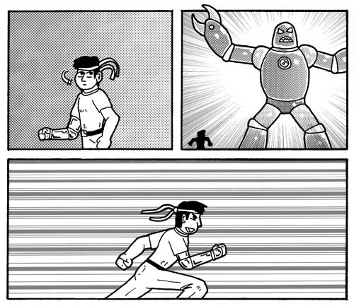
    1. Follow the same procedures as the negative-space screentone, up to step 4.
    2. If you want the speedlines only to exist in the negative space, then continue on with the negative-space procedure.
    3. If you want the speedlines to overlap the positive-space figure, then simply use the rectangular tool for outlining the panel. Invert the selection and delete what you don't need.
    THE PRODUCT THUS FAR
    After much detailed tone work, here is what we have to show for our efforts:


    Whew!

    Nice and toned and textured! Is it done yet?

    Maybe it is and maybe it isn't. Do you want to color your picture? Do you want to maybe put in some grey shadows or just fill in shades for contrast? If so, you might want to continue with the tutorials...

    Next, on to Adding Shades or Colors!
    OR
    Back to Tutorial Menu!


    "Active Stupor Heroes" is hosted by Comic Genesis, a free webhosting and automation service for webcomics.

    All material on this site is copyright 2002-2006 by me: Jason Tucker.